Home Value Forecast
Why have home prices in some markets been less responsive to low mortgage rates than would be expected?
“It is very likely that the top tiers of the owner occupied housing market are the ones benefiting the most from lower mortgage rates as this group has been less affected by credit score downgrades or more restrictive underwriting.”
Historically when interest rates decline significantly as they have in the U.S. over the last four years thanks to QE1, 2 and 3 and the Fed’s commitment to buy mortgage backed securities, we generally see home prices increase. In fact this inverse relationship has been strong and steady for decades. In Exhibit 1 below we show the inverse correlation between median home purchase prices conventionally financed by Freddie Mac versus 30 year fixed rate mortgages rates. The relationship starts to break down in 2008 and beyond, and yet in some cities we have seen fairly rapid price increases, mostly within 2012 and early 2013. Why are some markets responding while others lag?[2]
Exhibit 1: Median Purchase Prices on Freddie Mac Financed Homes
We believe there are three dominant reasons why interest rates and a loose monetary policy are not stimulating housing prices as much as they have historically:
- Credit scores for many households have been impacted by defaults, loan modifications, foreclosures, job losses and the breadth of the impact has been sufficient to affect millions of households who now must become or are already renters. Even though buying may be cheaper than renting, such households have little choice but to sit on the sidelines for a few more years.
- Tight underwriting has increased both the time required to secure a mortgage loan and the challenges for those with less secure income streams. Those paid based on self-reported productivity are being affected more severely since the lenders are now requiring more conservative assumptions on future earnings. Appraisals are also being kicked back if they are not conservative in the selection of appraisal comps, and so the risk tolerance pendulum has swung towards extreme conservatism.
- The investment appeal of housing and presumption that prices can only go up has lost its shine. Many households had stretched in the 2000-2005 run up and some even invested in second homes or investment properties hoping to flip these units at higher prices. Those late to the party got burned.
We have no ability to empirically test these and may never be able to accurately measure the second two factors described, but we believe they are widely accepted as factors affecting the housing market in 2013.
Drilling Down By Market
While we expect inverse relationships between interest rates and home prices, the lack of response since 2007 in many markets may be due to the extent that each market was affected by appetites for subprime and second mortgages.[3] Recent run ups may also be a result of support from greater investment buying is those markets that got hit the hardest. We first drill down on Chicago.
The typical inverse correlations between monthly mortgage rates and prices, in this case single family home price per square foot, for the Chicago metropolitan area are shown below:
Period of time Correlation with 30 Year FRMs
1980-2012 -.803
1990-2000 -.566
2001-2005 -.766
Since 2005 .897
For the past four years the housing market has behaved differently in Chicago and for that matter in most other markets. Since January of 1980 to present the monthly average 30 year fixed rate mortgage, FRM, (Source: Freddie Mac) has been 8.45%. Since April of 2010 the 30 year FRM has been under 5% and in February of 2012 when home prices hit their bottom in the Chicago metro market at $137 per square foot for single family housing, the mortgage rates were 3.89%. In September of 2012 they were down to 3.47% and finally prices have shown some modest bounce, but much less so than most hard hit markets. These results are shown in Exhibit 2.
Exhibit 2: Chicago Metro Single Family Prices Per Sq Ft Versus 30 Year FRM
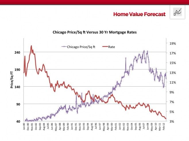
* Data: Freddie Mac and Collateral Analytics
In Exhibit 3 we show the results for just 2005 through first quarter 2013. If you look only at Exhibit 3 you’d think that, at least in Chicago, home prices move with interest rates instead of inversely to them.
Exhibit 3: Home Prices Per Sq Ft in Chicago Since 2005 Versus Fixed Rate Mortgages
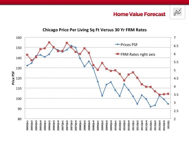
We fully understand that there are many factors driving home prices not mentioned above, such as employment trends and household disposable incomes, tax policies, land supply constraints and more.[4] But even without trying to controlling for all these factors as well as credit access and the changing appeal of housing as an investment, we still see that generally interest rates matter a great deal and the recent price response in Chicago has not been typical. We speculate that the fact that Chicago is in a Judicial foreclosure state with clogged courts and slow disposition of distressed real estate is part of the story. Technical factors which we have discussed in previous articles are revealing. The Months of Remaining Inventory (MRI) for Chicago is an average of 8.5 months, well above the national average. The distress percent of total sales based on REO sales is still over 36% as of first quarter of 2013. The Selling Price to List Price Ratio is 95.87%. Let’s compare these to a market where distress has been dealt with more rapidly and where MRI is low.
Exhibit 4: Home Prices Per Sq Ft in Phoenix Since 2005 Versus Fixed Rate Mortgages
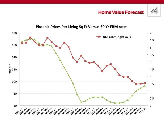
In Exhibit 4 we see Phoenix home prices rebounding strongly in 2012. Compare the other statistics with Chicago. The Months of Remaining Inventory are 4.28 with several neighborhoods having only one month of inventory. The selling price to listing price ratio is nearly 100 indicating multiple bids on many homes for sale. The REO sales as a percent of total sales are down to 16.5% versus 34.5% in the 4th quarter of 2011 and less than half of the figures observed in Chicago. We also suspect that Phoenix was one of the targets of many investors who responded to the low prices of late 2009 and the fact that rental yields were well above those available in many other markets.
Implications for the Housing Market
Average prices per square foot for regular (non-distress) sales for an entire metro market or for that matter for the nation as a whole may not be responding to the stimulus of low interest rates to the extent historically observed. However some markets have started to respond and they tend to be characterized by low inventories, declining distress inventories and multiple bidders as suggested by the high Selling Price to List Price Ratios. Affordability is definitely improved when mortgage rates are lower and yet the beneficiaries of these more attractive mortgage rates are not evenly distributed among households of all incomes and wealth. It is very likely that the top tiers of the owner occupied housing market are the ones benefiting the most from lower mortgage rates as this group has been less affected by credit score downgrades or more restrictive underwriting. At the same time we expect that investors have supported the lowest price tiers and are now bidding up the remaining REO sales in an attempt to lap up what is left of distress. Prices in the bottom housing price tiers are still dealing with foreclosure inventory hangovers in some markets with slow and clogged foreclosure systems. Markets where distress has been dispatched more expediently seem to be recovering the fastest.
[1] Norm Miller is a Professor at the Burnham-Moores Center for Real Estate, University of San Diego. Norm was the lead writer of this piece, assisted by Michael Sklarz, CEO of Collateral Analytics and James Follian, Principal of James R. Follian LLC. Bios are available on their website.
[2] This is similar to the question asked by Donald Kohn at the Jackson Hole meeting of central bankers: “What’s holding the economy back [despite] such accommodative monetary policy for so long?” See the Economist, Sept. 8th, 2012. The Mystery of Jackson Hole.
[3] Amir Sufi of the University of Chicago presented information at the fall 2012 Jackson Hole meeting that “retail spending and car sales have been weaker in states that entered the recession with higher household debt (ratios)” The Economist, Sept. 8th, 2012, The Mystery of Jackson Hole.
[4] See for example “Integrating Market Conditions Into Fundamental Home Price Forecasts” by N. Miller and M. Sklarz, Journal of Housing Research, 2012, 24:2, 183-213.