Home Value Forecast
Negative Equity: Stage One of Distressed Real Estate Inventory
One of the most challenging issues in today’s housing market is how to develop public policies and business practices that facilitate a reduction in the size of the inventory of distressed real estate. Though many potential remedies are in place and have been proposed to reduce the size and impact of the distressed inventory, much work still needs to be done.
One of our contributions to the ongoing debate focuses on the development of accurate measures of the size of the distressed inventory. This entails distinguishing among the different stages of distress and the variations in the size and nature of the distressed inventory in local housing markets.
In an earlier article titled “Measuring the Size of the Inventory of Distressed Real Estate: The Drain Is Still Clogged”, we offered an overview of the three stages of distressed inventory.
- Stage One consists of properties where borrowers have negative equity and are facing the decision of whether or not to default on their mortgages.
- Stage Two consists of properties that have gone into default and are facing the prospect of foreclosure.
- Stage Three consists of properties in which foreclosure has already taken place and are awaiting transition back to the market via an REO (real estate owned) sale.
The earlier article offered estimates of the size of the Stage Three inventory for eight counties in New York and California. Today’s article presents estimates of the Stage One inventory – the number of properties with negative equity – for the same eight counties. The measures presented show wide variations among the markets considered, and confirm the importance of distinguishing among the three stages of distress.
Rationale for Labeling Properties with Negative Equity as Distressed
These properties are considered “distressed” because substantial evidence has accumulated over the past two decades showing that the main driver of serious mortgage delinquency and default is the amount of owner equity in the property. Some of the evidence highlighting the importance of this stage of distress is theoretical. When faced with changes in income and employment circumstances, borrowers with substantial equity are better off selling the property, paying off the existing debt and moving to a less expensive home, as opposed to defaulting on the mortgage and incurring the negative impacts on the borrower’s credit score.
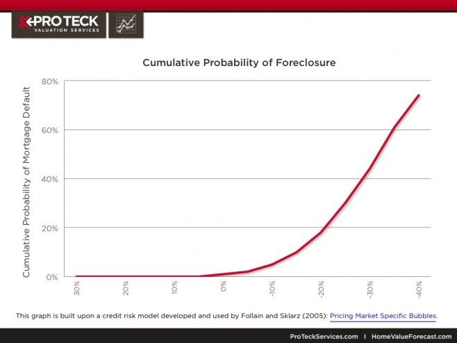
Substantial empirical evidence has also been amassed to label properties with negative equity as distressed. For example, the following graph captures a widely agreed upon relationship between the amount of equity in a property and the probability that a borrower will default on his or her mortgage. The exact amount of negative equity that leads a borrower to “walk away” or “turn in the keys” to the lender does vary among borrowers. A typical pattern is a sharp increase in the probability of default as soon as equity becomes negative, and then it rises more and more steeply as equity becomes more and more negative. If equity is -40 percent of the property value, the probability of default is in excess of 75 percent. [1]
American Housing Survey Based Estimates of the Number of Properties with Negative Equity
A recent study by Carter (2012) offers measures of the number of properties with negative equity. [2] The analysis used data from the American Housing Survey (AHS) for 1997 through 2009. The study concludes that the size of this inventory has risen substantially in recent years.
In the years prior to the latest housing bust, the percent of inventory with negative equity prior to the bust ranged from 3.58 percent (2001) to 5.12 percent (2003). After the bust, the percent of inventory with negative equity more than doubled to 11.59 percent in 2009. The study also offered a number of insights about the distribution of the properties with negative equity and the challenges in measuring them. Among the most important:
- The AHS-based estimates rely upon the owner-occupants estimates of home values, which are thought by many to lag behind changes in the market value during periods of rapid market decline. The study offers adjustments designed to take account of a potential upward bias associated with owner estimates of value.
- The AHS estimates are much smaller than some other estimate for 2009, which are attributed to differences in the methodologies used to measure negative equity and the housing population they cover in their estimates.
- The AHS data provide the opportunity to examine variations in the number of properties with negative equity for a number of household categories and mortgage types. For example, minority, younger households, and borrowers with adjustable mortgages are much more likely to have negative equity.
- The AHS offers very little insight regarding geographic variations in the incidence of negative equity. Information is provided for the four census regions. It is highest in the West in 2009 (15.87 percent) and lowest in the Northeast (7.49 percent).
The paper contains estimates for a variety of other portions of the population and the housing stock.
New Measures of the Number of Properties with Negative Equity from Home Value Forecast
Home Value Forecast uses data generated by Collateral Analytics (CA) to estimate the number of properties with negative equity for 2005 through 2011. The process underlying these estimates is as follows:
- The population of single family residential properties is constructed in 2005:Q1 and is the focus of the measures for each subsequent quarter.
- A property with negative equity is determined by comparing CA’s AVM estimate for each property to the size of the mortgage associated with the property at origination. No adjustments are currently made to principal reductions or for additional debt since origination.
- If the AVM estimate is below the initial mortgage, the property has negative equity.
As in our earlier article, attention is focused upon eight counties. Four are downstate New York counties: Nassau, Suffolk, Ulster and Westchester; and four are counties in the Eastern parts of California that have been hit very hard by the crisis: Merced, Riverside, San Bernadino and San Joaquin. We also provide information at the ZIP code level for selected years within these counties. Our goal is to both examine and highlight the wide variations in the size of the stock with negative equity among local housing markets and the potential role played by state foreclosure laws and policies.
The first look at these data focuses on the percent of single family residences with negative equity from 2005: Q1 through 2011: Q4 (Figure 1).
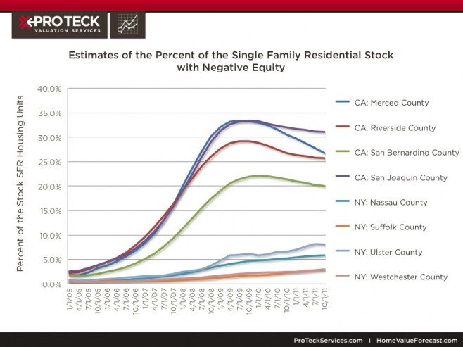
Figure 1: Estimates of the Percent of the Single Family Residential Stock with Negative Equity
The fraction of these properties with negative equity was below 5 percent for all eight counties in 2005 but then begins to rise rapidly, especially in the four California counties. The peak rates were achieved in the four California counties in the latter half of 2009 and early 2010. The highest rates were in Merced (33.1 percent) and San Joaquin (33.1). The rates have declined in each of these counties since 2009 though they remain well above pre-crisis rates.
The rates for the four New York counties continued to rise through 2011. The highest are in Ulster (8.2 percent) and Nassau (5.9 percent). Note the dramatic increases in each of these counties since the beginning of the crisis. The rate is 10 times higher than the 2005 rates for Ulster and 20 times higher in Nassau.
Highlighting Variability Within Counties
The size of the inventory with negative equity was also computed for each of the 500+ ZIP codes in these eight counties for the same time period. The results are presented in Table 1 for the ten largest ZIP codes in each of the eight counties for 2009:Q1 and 2011:Q1 along with the simple averages of the values for these ten ZIP codes.
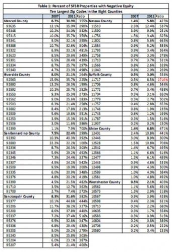
Table 1: Percent of SFSR Properties with Negative Equity
These results confirm the large increases in the share of properties with negative equity between 2007 and 2011 in most ZIP codes. The 2011 rates are usually three to six times larger than the 2007 rates. One outlier is ZIP code 11717, which is located on Long Island. The percent of the stock of SFSR units increased from 0.5 percent to 8.5 percent between 2007 and 2011 and offers an example of a place outside of the SAND states hit very hard by the current crisis.
Another main takeaway of the table is the wide variation among the ZIP codes around the averages for both years. Riverside and San Bernadino counties have a relatively large dispersion around their county averages. For example, 35.7 percent of the units in ZIP 92563 from Riverside have negative equity in 2011 compared to only 7.9 percent in ZIP 92399. The wide variability among ZIP codes is also captured in Figure 2, which maps the Stage One measure of distressed real estate for ZIP codes in Nassau County, NY as of July 2011. Notice the relatively low rates in the north end of the county relative to other parts. The highest rates are in and around Hempstead, NY.
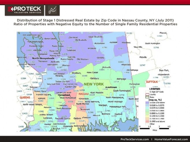
Figure 2: Distribution of Stage 1 Distressed Real Estate by ZIP Code in Nassau County, NY (July 2011): Ratio of Properties with Negative Equity to the Number of Single Family Residential Properties
Drivers of the Share of Properties with Negative Equity
What are the main drivers that affect the Stage One inventory of distressed real estate? One obvious driver is the behavior of house prices. Substantial declines in house prices, all else equal, can lead to more properties with negative equity. The pattern is demonstrated by plotting the median sales price per square foot of properties sold by regular and Real Estate Owned (REO) sales. Indeed, the data offered in Figure 3 capture the large declines in house prices experienced within these counties, especially the four California counties.
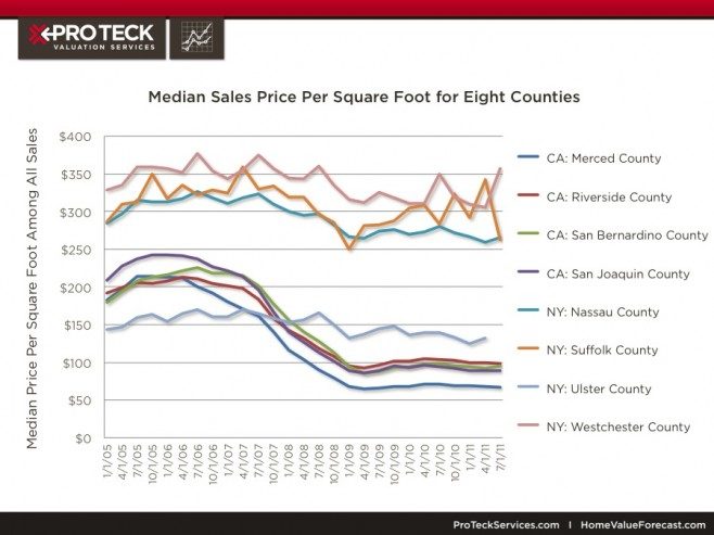
Figure 3: Median Sales Price Per Square Foot for Eight Counties
Prices are half of what they were at the peak in the four California counties. The four New York counties also experienced price declines since reaching their peaks in 2006 and early 2007. Though the magnitudes of these declines were smaller in the New York counties than in California counties, prices at the end of 2011 were about 20 percent below their peak values in three of the of the New York counties (all but Westchester).
The other and perhaps more interesting and complex set of factors pertain to the various ways in which borrowers adapt to a negative equity position. Home Value Forecast has developed metrics that capture the evolutionary process, including the number of properties in Stage One that ultimately become foreclosures, REO sales, refinances, short sales, and those that experience no further transaction. Future articles will present these findings. Here attention is focused upon the latter category: the fraction of inventory with negative equity at the start of a period that still has negative equity as of the end of 2011. These data are presented in Figure 4.
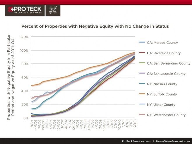
Figure 4: Percent of Properties with Negative Equity with No Change in Status
The strong upward trend reflects, in part, the fact that the data are tracked until the end of 2011, hence the inventories in the 2010 and 2011 have had much less time to adjust than the inventory in earlier years. Nonetheless, the graph offers insights about the cross-section variation. Consider San Bernadino and Suffolk County in 2009: Q2: 45 percent of the San Bernadino properties with negative equity in that period are still counted among the inventory with negative equity and have not left this stage by foreclosure, short sale or any of the other options tracked in the data. The number in Suffolk County is substantially higher at 76 percent. One likely explanation is that the foreclosure process itself is much slower in New York State than in California, which increases, all else equal, the properties that remain in stage one of the distressed inventory.
Conclusions and Next Steps
Several conclusions are suggested by the analysis in this article. First, the size of the distressed inventory based upon our Stage One measure – percent of the stock with negative equity – is much larger than one based upon Stage Three (foreclosed). For example, the percent of the housing stock with negative equity in Suffolk County, NY in 2010 was about six times larger than the amount in the foreclosure inventory (2.6 percent versus 0.4 percent). This and other comparisons to support this conclusion can be obtained by comparing the results in Figure 1 to those reported in Table 2 of the earlier article. Second, the size of the Stage One inventory continues to rise in the four New York Counties though it has diminished since 2010 in the four California counties. This is due in part to the fact that the declines in house prices in the New York counties have occurred more recently than in the California counties. However, the relatively large size of the Stage One inventory in New York also reflects the fact that foreclosure takes much longer in New York than in California. More generally, these results and those in the earlier article strongly confirm the wide variation among local housing markets in the measure of distress. These variations are observed among counties in different states, counties within the same states, and ZIP codes within the same county.
A top priority in our future analysis is to learn more about the various ways in which the inventory of properties with negative equity evolves or transitions to other stages and, ultimately, back to the normal or nondistressed housing inventory. Some will enter the foreclosure process. Some will be resolved by short sales and loan modifications. Many, as suggested by Figure 3, can sit in Stage One for many months and even years. Exploration of these various transitions will be the subject of a future article.
The ultimate goal of this work and the value of the data accumulated for this work are to link these data and measures to the ongoing policy debate about the best ways to dissolve the inventory of distressed real estate. As noted in our January article, this process has become much more complex than the one incorporated into most models of credit risk prior to the bubble bust. A much wider set of options is available today and the process has been affected by a variety of new policy interventions and market developments. Our expectation is that geographically granular data like Home Value Forecast will shed light on state and local policies that may be helping and hindering the dissolution of the distressed inventory, especially in the areas with the largest inventories of distressed real estate and where the external costs of foreclosed and vacant properties are likely the highest.
[1] This graph is built upon a credit risk model developed and used by Follain and Sklarz (2005): Pricing Market Specific Bubbles.
[2] See http://www.huduser.org/portal/periodicals/cityscpe/vol14num1/ch7.html
James R. Follain, Ph.D.
James R. Follain LLC and Advisor to FI Consulting
jfollain@nycap.rr.com
Norm Miller, PhD
Professor, Burnham-Moores Center for Real Estate
University of San Diego
nmiller@sandiego.edu
Michael Sklarz, Ph.D.
President
Collateral Analytics
msklarz@CollateralAnalytics.com
About Home Value Forecast
Home Value Forecast was created from a strategic partnership between Stewart Valuation Services and Collateral Analytics. HVF provides insight into the current and future state of the U.S. housing market, and delivers 14 market snapshot graphs from the top 30 CBSAs. Each month, HomeValueForecast.com delivers a monthly briefing along with “Lessons from the Data,” an in-depth article based on trends unearthed in the data.
HVF is built using numerous data sources including public records, local market MLS and general economic data. The top 750 CBSAs as well as data down to the ZIP code level for approximately 18,000 ZIPs are available with a corporate subscription to the service. A demonstration is available upon request. Please visit the Contact Us page to request a demonstration.

