Home Value Forecast
The Effect of Higher Loan-to-Value Ratios on Market Volatility
One theme that we have discussed in the past year in helping understand the home price “bubble” of the 2004 to 2006 period is the effect of leverage on both price increases and the subsequent declines. In particular, it has been well documented that excessive leverage enabled buyers to pay higher prices than they normally could have qualified for as on the upside of the cycle. It has been less clear that this same high leverage also led to more significant prices declines on the downside of the cycle.
The best measure of the amount of leverage being used by buyers in a particular real estate market is the loan-to-value ratio of all the mortgages which were taken out in purchase (or refinance) transactions. To best see this phenonomenon in action, we highlight two ZIP codes in Los Angeles County. Figure 1 show the single family price history of one of the ZIP codes in Palmdale, CA (ZIP code 93552) which saw prices decline by more than 60 percent from its 2006 peak.
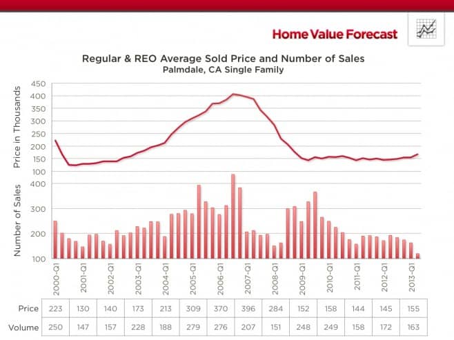
Figure 1: Regular & REO Average Sold Price and Number of Sales
Figure 2 shows this same price history along with the total purchase mortgage amounts. Note how close the two series are to one another, which translated to an average LTV Ratio over this entire period of approximately 94 percent.
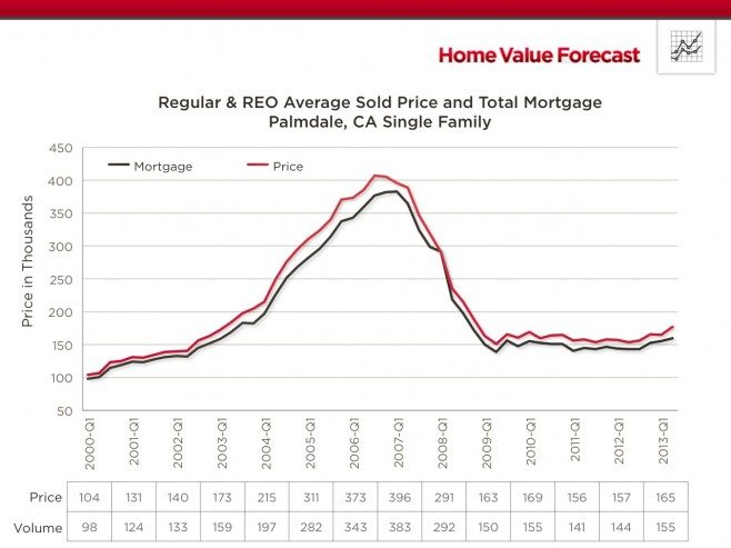
Figure 2: Regular & REO Average Sold Price and Total Mortgage
The interesting observation about the bubble period is that much of this increased leverage was achieved through the use of second mortages, as seen in Figure 3.
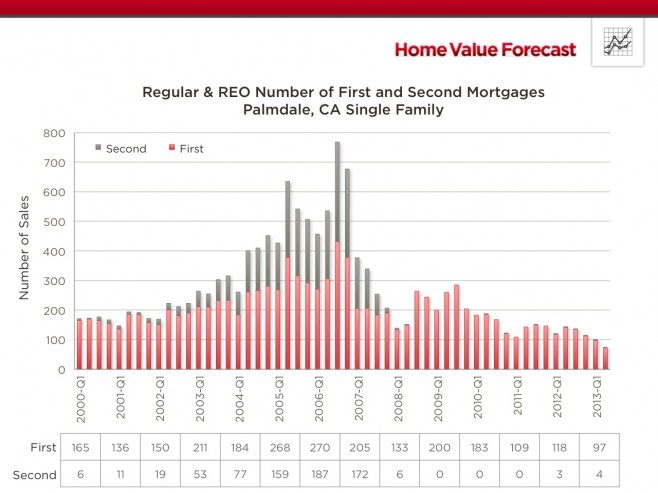
Figure 3: Regular & REO Number of First and Second Mortgages
While it has been well documented that high LTVs lead to riskier mortgages, there has been much less research showing the correlation between high LTVs leading to greater home price declines. It should not be too surprising that high leverage in the real estate market should give rise to greater price volatility in a similar way that it does in the commodity markets. The reason is that as prices decline, homeowners are much less inclined to stay with their positions since they have little or no equity to protect. Their liquidations lead to more price declines which has a cascading effect on other leveraged owners and the prices where they ultimately get.
The counter example is ZIP code 91007, which is Arcadia CA, another market in Los Angeles County. Figure 4 shows its price history back to 2000 and its remarkable performance during the post-bubble period. As seen, single family prices in this market experienced a very shallow decline in 2008 and 2009 and are currently at all-time high levels.
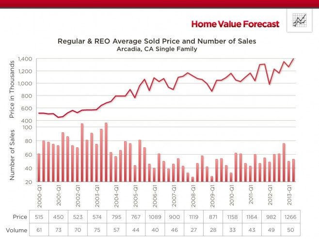
Figure 4: Regular & REO Average Sold Price and Number of Sales
Not surprisingly, as seen in Figure 5, there has been a much wider spread between purchase price and total mortgage amount over this period, which has translated to LTVs averaging well below 70 percent.
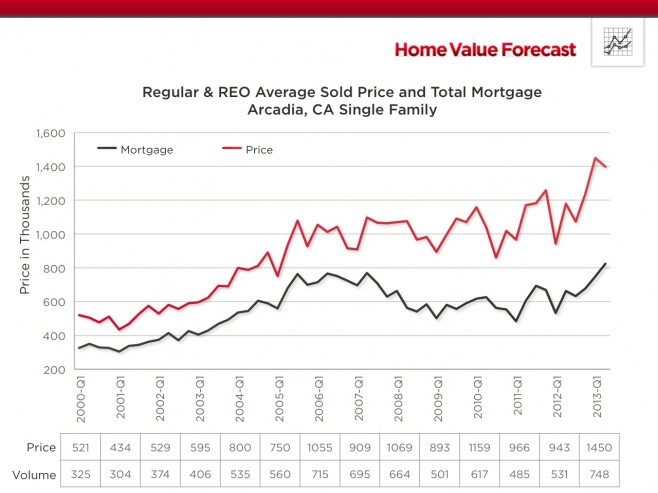
Figure 5: Regular & REO Average Sold Price and Total Mortgage
In addition, as seen in Figure 6, the percentage of purchases where second mortgages were used during the bubble period was far lower than in Palmdale and similar high LTV markets.
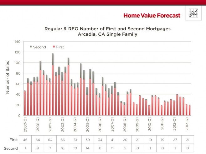
Figure 6: Regular & REO Number of First and Second Mortgages
Figure 7 shows a summary of this phenomenon for all the active ZIP codes in Los Angeles County. Each point on the chart shows the median total LTV ratio for homes purchase in 2005 plotted against the subsequent peak-to-trough price percentage decline that occurred in the 2009 to 2011 period. The obvious pattern of higher LTVs being correlated with larger price declines can be seen in this chart as well as in a number of other counties around the U.S. where we have done a similar analysis.
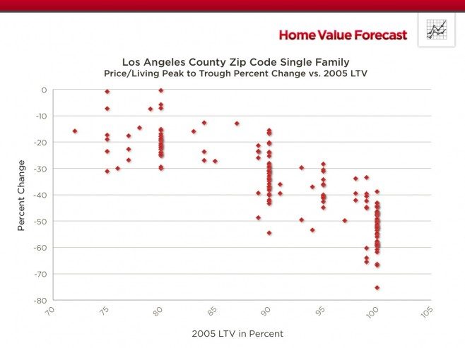
Figure 7: Price/Living Peak to Trough Percent Change vs. 2005 LTV
CBSA Winners and Losers
Each month Home Value Forecast ranks the single family home markets in the top 200 CBSAs to highlight the best and worst metros with regard to a number of leading real estate market based indicators.
The ranking system is purely objective and is based on directional trends. Each indicator is given a score based on whether the trend is positive, negative, or neutral for that series. For example, a declining trend in active listings would be positive as will be an increasing trend in average price. A composite score for each CBSA is calculated by summing the directional scores of each of its indicators. From the universe of the top 200 CBSAs, we highlight each month the CBSAs which have the highest and lowest composite scores.
The tables below show the individual market indicators which are being used to rank the CBSAs along with the most recent values and the percent changes. We have color-coded each of the indicators to help visualize whether it is moving in a positive (green) or negative (red) direction.
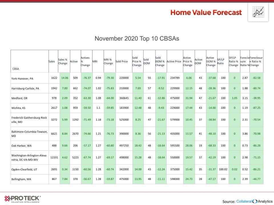
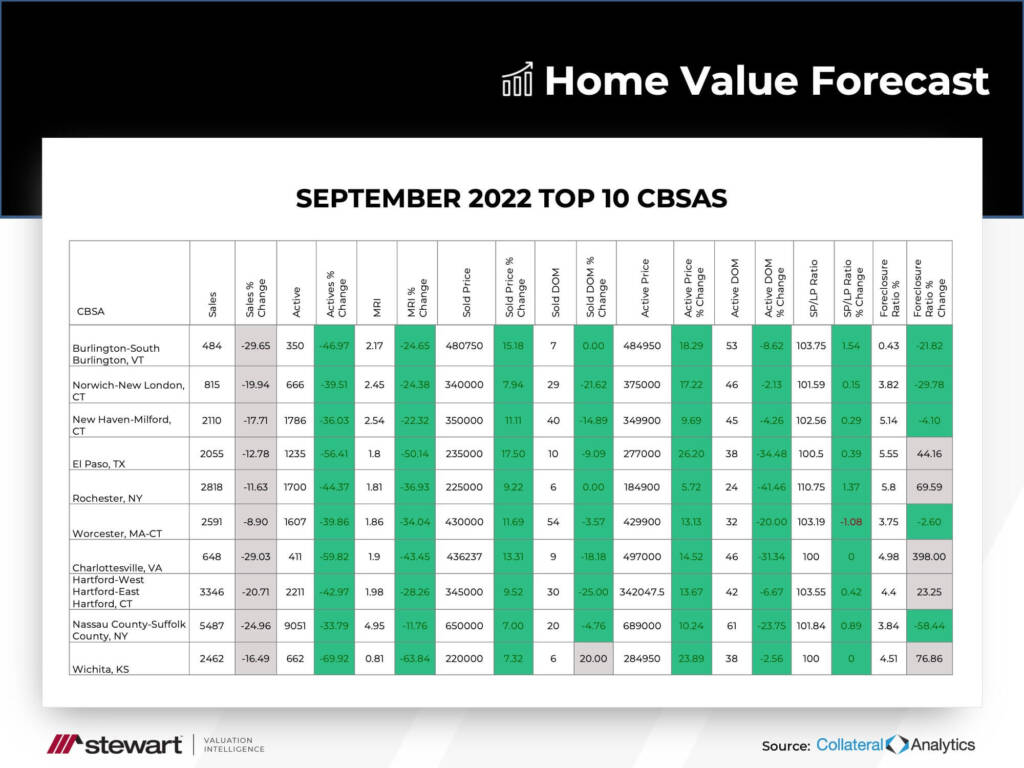
Top 10 CBSAs
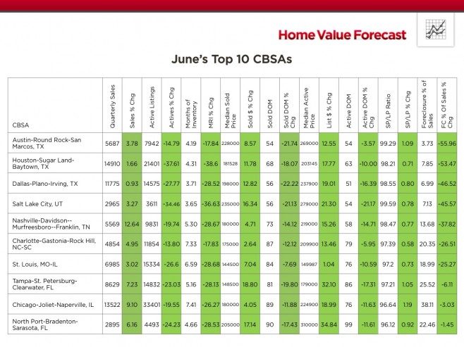
The top ranked metros in the current month include markets from most major regions of the U.S. Of particular note is that three of the top markets are in Texas and include the large Houston and Dallas CBSAs. Two new entrants to the Top 10 List are Chicago and St. Louis which suggests that the sharp recovery in the coastal U.S. markets of the past 9 months is now beginning to reach some of the important interior U.S. markets. Florida continues to be well represented in the Top 10 List by two of its west coast markets, the Tampa-St. Petersburg-Clearwater and North Point-Bradenton-Sarasota CBSAs.
An interesting development that we have highlighted in recent months is that several of the previously top markets from late last year are no longer in the list because their year-over-year sales counts are down sharply. However, the reason for this is that sales are being constrained by a lack of inventory rather than a decrease in demand. Of note is that all of the Top 10 markets this month are exhibiting positive trends in every one of the indicators that we follow.
Bottom 10 CBSAs
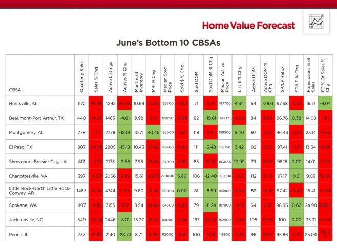
The bottom ranked metros also represent an interesting mix of markets around the country. As seen in the table, nearly all have high single or double-digit Months of Inventory Remaining. If there is a common theme among these, it is that all are relatively small markets based on both population size and sales activity. We know that one of the catalysts behind the current real estate market recovery has been large investment funds purchasing distressed single family homes to rent out. They have been focusing on a number of the larger and more visible metros and have probably been overlooking smaller markets such as the ones in the Bottom 10 List.
Outliers
In this month’s Outliers, we highlight the Chicago-Joliet-Naperville, IL CBSA, which is currently in the list of the Top 10 metros. As seen in the ranking table above, all of the important market indicators for this CBSA are showing positive trends on a year-over-year basis including declining inventory, lower Inventory Remaining, declining market times and lower distressed sales activity to name a few.
Within this CBSA there are numerous sub-markets. On a ZIP code level, one of particular interest is Glenview IL (ZIP code 60026), which is one of its higher priced markets in this metro.
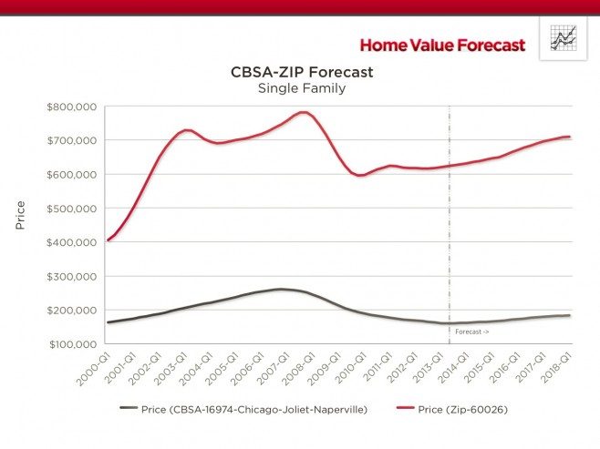
Figure 8: CBSA – Chicago-Joliet-Naperville | ZIP 60026, Glenview, IL
As seen in Figure 8, single family home prices in this ZIP code held up better that the overall Chicago metro since the market peak. More importantly, as seen above, our home price forecast models call for this ZIP code to continue to outperform the surrounding metro and move closer to its previous peak levels over the next several years.
There are a number of reasons for the historical and forecasted outperformance of this ZIP code, which include the fact that homebuyers in this ZIP code have historically been better capitalized and thus better able to weather declines in home prices. This follows our discussion above. The average loan-to-value (LTV) ratio in ZIP 60026 has historically been between 70 and 75 percent compared to approximately 80 to 85 percent for the overall Chicago-Joliet-Naperville, IL CBSA.
About SVI’s Monthly Housing Market Report
The Home Value Forecast uses a ranking system that is purely objective and is based on directional trends of nine market indicators. Each indicator is given a score based on whether the trend is positive, negative or neutral for that series. For example, a declining trend in active listings would be positive, as would an increasing trend in average price. A composite score for each CBSA is calculated by summing the directional scores of each of its indicators. From the universe of the top 200 CBSAs, each month we highlight topics and trends in the real estate market.