Home Value Forecast
Houston Affordability and Changing Markets
Houston made our list of top ten metros this month, and for good reason. Houston as a whole never went through a serious correction like the rest of the country; rather it experienced a slight dip, followed by gradual price appreciation.
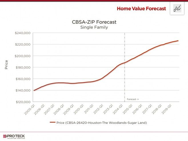
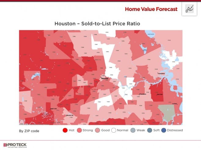
Houston’s prominence in the energy sector helped lessen the impact of the housing crisis. As crude oil prices began to rise in 2010, Houston’s employment (thus housing market) began to heat up. As a result, Houston was the first of the 20 largest US cities to reclaim all jobs lost during the recession, according to the US Bureau of Labor Statistics. They are still growing today. Below is a “Heat Map” using the top/bottom 10 methodology at the ZIP code level. As you can see, most of Houston’s real estate is extremely healthy.
So what do home price trends look like at the neighborhood level? Houston’s real estate market is vast and layered with different ZIP codes and even different neighborhoods experiencing different futures. Below we’ve highlighted three ZIP codes against the average for the metro:
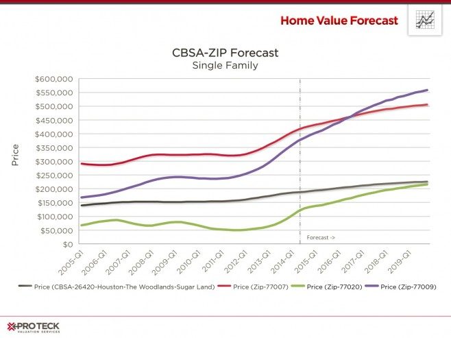
The three ZIP codes are all close to downtown, with the Near Northside (ZIP 77009) and Washington Avenue (77007) communities being of most interest. As you can see, both are experiencing dramatic price appreciation that is projected to continue, according to the Collateral Analytics Home Price Forecasts.
So what is it about these communities? Like many urban areas, traffic (Houston is rated the 14th worst in the nation) has driven up prices in communities closer to work. Also, the Northside is full of historic homes, many that are being refurbished by their new owners.
With the work comes increasing prices, impacting affordability to many.
Affordability
Affordability is derived by looking at the median income for a particular area as a ratio to the mortgage payment needed to purchase a median priced home. An index score above 100 signifies that a household earning the median income has more than enough income to afford the mortgage. Lower scores suggest more income is needed to cover mortgage expenses. The Collateral Analytics Affordability Index used by Home Value Forecast also looks at loan-to-value norms for a particular area to adjust for more affluent buyers usually putting more money down.
Affordability is up nationwide. Between the housing crash and historic lows in mortgage rates people have been able to afford more today than in the recent past. Looking below at Miami brings this phenomenon to light.
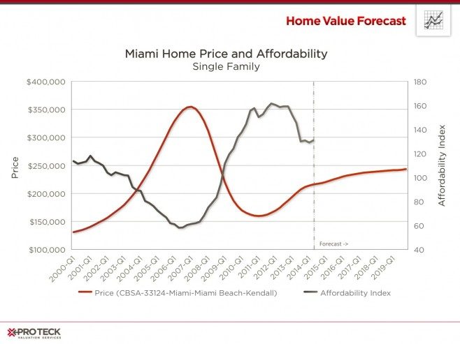
Miami’s prices peaked in 2007, affordability predictably hit its low of 58 around the same time. As prices fell, affordability rose to a peak of more than 160. Currently Miami is holding steady around the 140 mark.
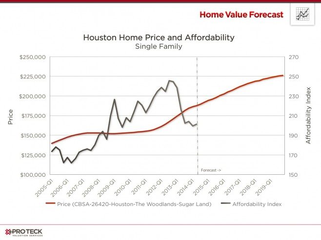
Houston affordability is a different story. Prices in the Houston – Woodlands CBSA held steady through the US housing crash (2007 – 2011) and have been increasing rapidly since 2012. Houston ranked No. 4 on Forbes’ list of “The U.S. Regions to Watch in 2014.” Houston had gross domestic product growth of 12.3 percent between 2007 and 2012, and job growth of 9.2 percent between 2007 and October 2013, blunting the impact of the financial crash on the region.
Housing price increases finally caught up to affordability in 2013 and has been dropping ever since. On a whole, Houston is still much more affordable than the rest of the country, with a Collateral Analytics Affordability Index score of 195.
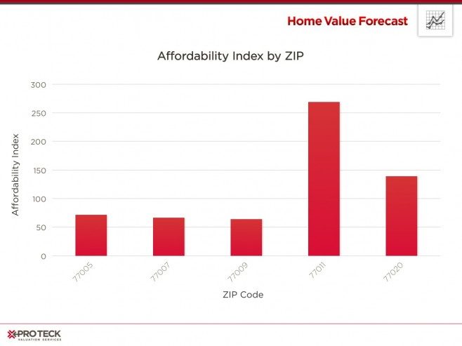
Going down to ZIP level, we see different affordability in neighboring ZIP codes. Looking at Near Northside (ZIP 77009) and Washington Avenue (77007), both have sub-100 affordability – making them much less affordable than the CBSA average of 195. On the flip side, ZIP Code 77011 is seeing a Affordability score of 270+.
CBSA Winners and Losers
Each month, Home Value Forecast uses a number of leading real estate market-based indicators to rank the single family home markets in the top 200 CBSAs to highlight the strongest and weakest metros.
The ranking system is purely objective and is based on directional trends. Each indicator is given a score based on whether the trend is positive, negative or neutral for that series. For example, a declining trend in active listings would be positive, as will be an increasing trend in average price. A composite score for each CBSA is calculated by summing the directional scores of each of its indicators. From the universe of the top 200 CBSAs, we highlight each month the CBSAs which have the highest and lowest composite scores.
The tables below show the individual market indicators that are being used to rank the CBSAs along with the most recent values and the percent changes. We have color coded each of the indicators to help visualize whether it is moving in a positive (green) or negative (red) direction.
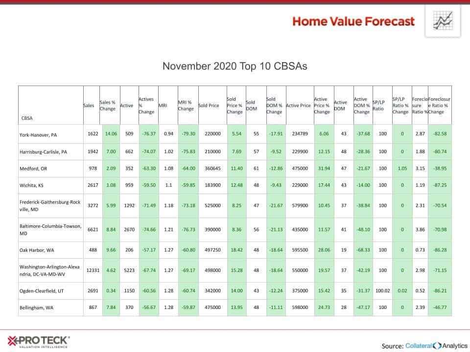
Top 10
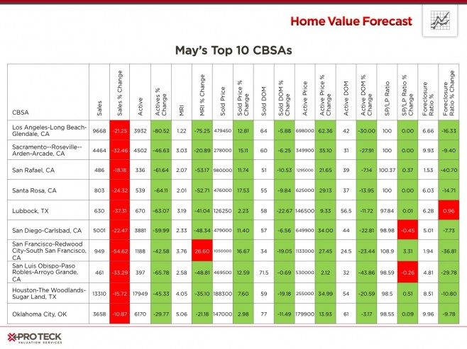
California continues to lead Home Value Forecast’s top ten. What’s amazing to see is the sales price as a percentage of list price ratio (SP/LP ratio), where the top four are at or above 100 percent. Housing stock is also tight, as seen by Months of Remaining Inventory (MRI) all being very low, leading to much competition for homes.
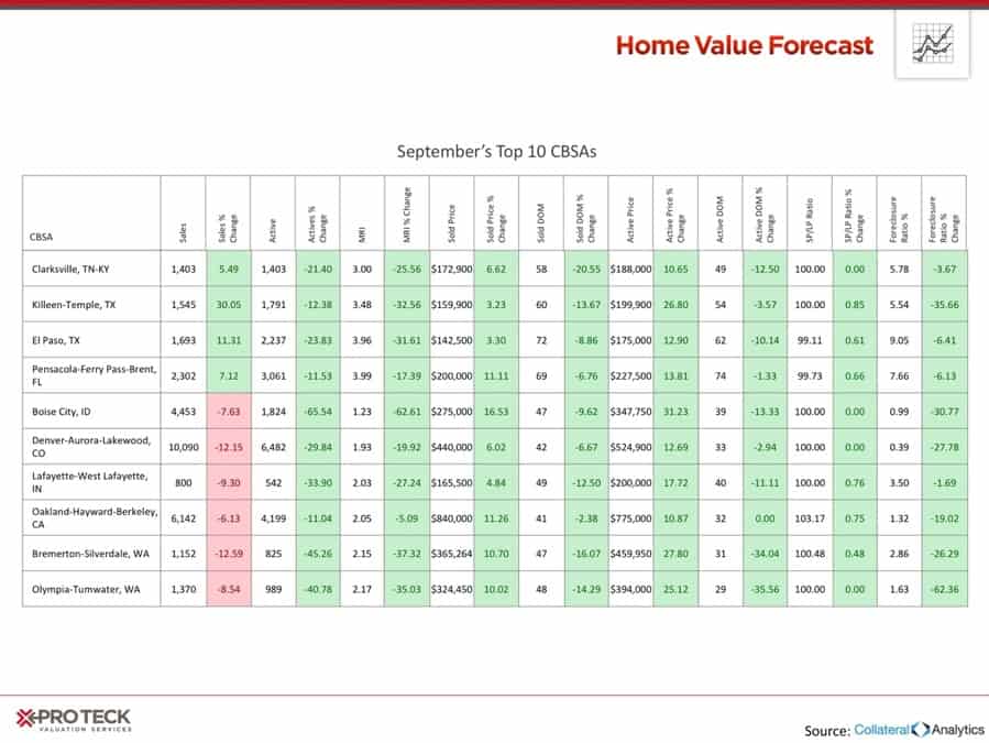
Bottom 10
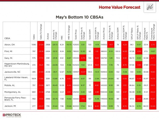
The bottom ten show more regional diversity this month, with only two metros from Florida. The bottom ten are fairly consistent in three indicators; Sales percent change, Active days on market percent change and Foreclosure ratio percent change. Sales are slowing down, days on market are growing and the percentage of foreclosure sales are increasing, all leading to a softer market. MRI is between 7 and 11 months, showing there is more housing stock than active buyers.