Home Value Forecast
Housing Market Trends Across the U.S. — The Difference Between West Coast/East Coast Markets
From clothing and music to food and social norms, many of the trends that sweep across the U.S. originate on the West Coast.
In today’s real estate market, we see many trends and the swapping of trends. This month, many of our West Coast CBSAs are showing up towards the top of our market ranking while the East Coast is showing up towards the bottom.
Looking back, we see a very different picture. The top/bottom 10 in our November, 2011 Update looked like this:
November, 2011 Top 10 CBSAs based upon our ranking system:
- Cape Coral – Fort Myers, FL
- North Port – Bradenton – Sarasota, FL
- Tampa-St. Petersburg – Clearwater, FL
- Lakeland, FL
- Orlando – Kissimmee – Sanford, FL
- Dayton, OH
- Tallahassee, FL
- Punta Gorda, FL
- Port St. Lucie, FL
- Holland – Grand Haven, MI
November, 2011 Bottom 10 CBSAs based upon our ranking system:
- Seattle – Bellevue – Everett, WA
- Virginia Beach – Norfolk – Newport News, VA/NC
- Reno – Sparks, NV
- Spokane, WA
- Tacoma, WA
- Tucson, AZ
- Vallejo – Fairfield, CA
- Beaumont – Port Arthur, TX
- Las Vegas – Paradise, NV
- Bremerton – Silverdale, WA
What’s the difference? The difference is timing.
In November, 2011 we said:
“The top ranked CBSAs exhibit a fairly consistent theme, which is that in nearly all cases prices have declined significantly (40 to 50 percent in some cases) from peak levels and have been moving sideways or slightly downwards for more than two years. While the first thought might be to assume that these are very depressed markets with little prospect for improvement, the positive trends in our various indicators suggest that buyers are taking advantage of the depressed prices and the corresponding excellent values.
Conversely, in a number of the lowest ranked CBSAs prices have held up quite well since the peak in the market — thus we are seeing less dramatic swings in values or a slight negative draw as the market strives for equilibrium.”
Seattle went from the bottom 10 in 2011 to the top 10 this month. Let’s look deeper into the Seattle market.
Seattle had its highest percentage of REO properties between Q1 2011 and Q1 2012, and hit the bottom in average price per living area in Q3 2011. The higher numbers of REOs were quickly worked through the system (non-judicial foreclosure process), leading to the sustained recovery we see today.
This trend can also be seen by comparing REO to regular sold price per square foot of living area. The “REO discount” (REO price/Regular sale price) was largest in Q2-Q4 in 2011, averaging 40 percent. Today that number is 24 percent and trending toward historical norms.
Outliers
All real estate is local, and what’s happening at the ZIP level is not always consistent with CBSA trends. In this regard, our analytic tool enables users to track real estate markets around the U.S. by county, city, ZIP code, or neighborhood, as well as by property type, transaction type, price range and property characteristics.
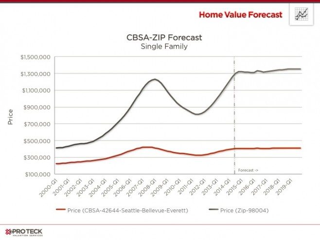
The following graph charts price trends of the Seattle CBSA versus an individual ZIP code, 98004 (Bellevue and Clyde Hill), within the CBSA. In the year 2000, ZIP 98004 was tracking prices approximately twice that of the metro as a whole — this changed dramatically in the years leading up to 2008, when Bellevue’s real estate values was three times the metro. The correction hurt Bellevue more than the overall metro, losing a third of the average value by mid-2011. This, however, has all been made up. Today, ZIP 98004 is above its 2008 peak (106 percent) and looks poised for more historically sustainable growth in the years ahead, according to the Collateral Analytics Home Price Forecast Model.
The overall metro is at 96 percent of its pre-crisis value, and also looks poised for realistic growth in the years to come.
CBSA Winners and Losers
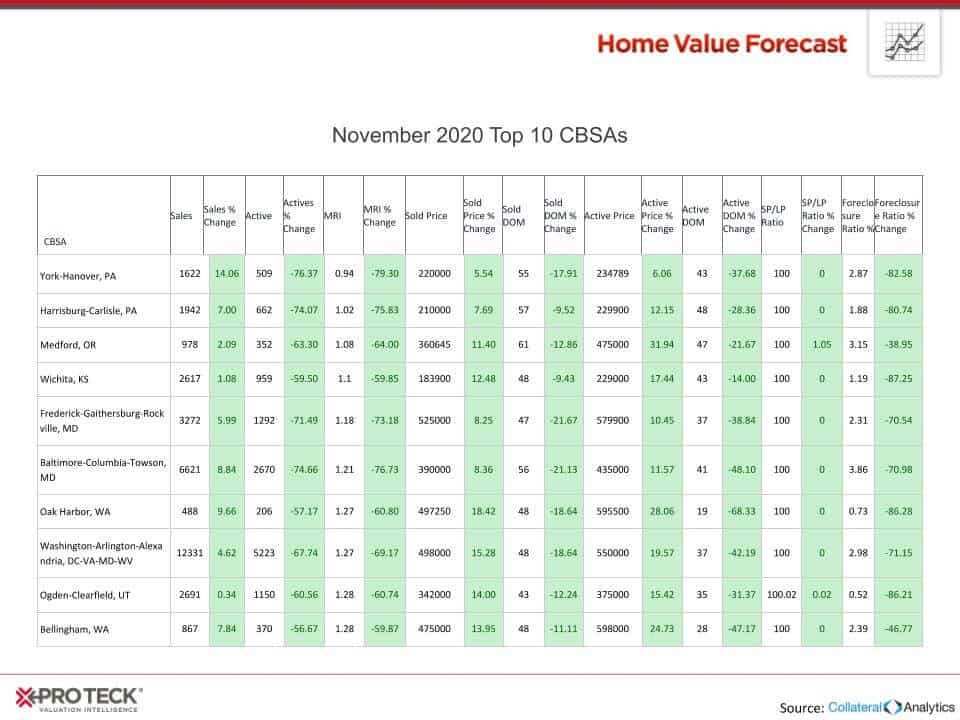
Each month, Home Value Forecast uses a number of leading real estate market-based indicators to rank the single family home markets in the top 200 CBSAs to highlight the strongest and weakest metros.
The ranking system is purely objective and is based on directional trends. Each indicator is given a score based on whether the trend is positive, negative or neutral for that series. For example, a declining trend in active listings would be positive, as will be an increasing trend in average price. A composite score for each CBSA is calculated by summing the directional scores of each of its indicators. From the universe of the top 200 CBSAs, we highlight each month the CBSAs which have the highest and lowest composite scores.
The tables below show the individual market indicators that are being used to rank the CBSAs along with the most recent values and the percent changes. We have color coded each of the indicators to help visualize whether it is moving in a positive (green) or negative (red) direction.
Top 10
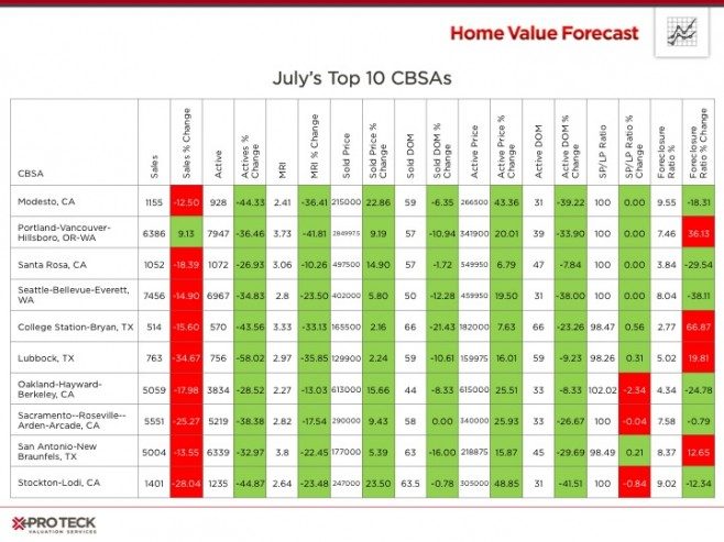
All of our top 10 markets are from the Western United States and all are exhibiting traits of very tight market — low inventory (active listings down), low Months of Remaining Inventory (MRI), lower days on market and high sale price to list price ratio. These hot markets are leading to very competitive prices for sellers.
Bottom 10
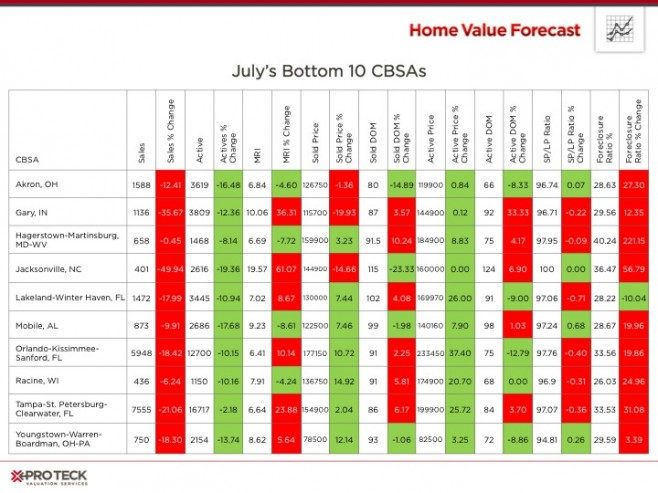
Although many of the indicators in the bottom ten are trending positive, we are still seeing more than six months of inventory in all markets, longer days on market and higher foreclosure ratios. We believe that higher foreclosure numbers are the reason these metros are seeing a slower recovery.